Improving product metrics with a map-first redesign
How replacing a list of places with a map improved user retention and engagement.
Product overview
Bumpin is a social discovery app for dating, socializing, networking, and new connections. It helps people find others who are not just nearby, but at the same place. Users can see who is around, start chatting, or arrange to meet.
The product's core idea is to turn everyday places into hubs for real-world social interaction.
Context
Bumpin was struggling with low user retention and engagement.
The home screen centered on a page for the user's current place and a list of nearby places. This created a steep learning curve, increased cognitive effort, and did not communicate the product's value clearly enough.
As a result, users struggled to understand the core interaction patterns and the need for precise location access, and were more likely to drop off after their first few sessions.
Product analytics revealed an important insight: users who engaged with the map more often had nearly 2× the retention rate.
This became the starting point for the redesign.
Outcome
Problem
An unclear core experience
Bumpin did not communicate its value clearly enough. Users struggled to understand how interactions worked or why they needed to check in at places. The product's value emerged too late, making the request for precise location access feel less justified.
A weak spatial mental model
The list of places made spatial relationships harder to understand. Users had to connect places, people, and the distances between them on their own. Finding social activity meant scanning the interface and holding that information in memory.
This created a high cognitive load and failed to convey a clear spatial model of what was happening nearby.
Low early retention
The interface created a steep learning curve. Users needed more time to understand the core interaction patterns and experience the product's value. This negatively affected retention and engagement during the first few days of use.
Research
Product analytics and user behavior
We analyzed product metrics, core user flows, and engagement across the app's key screens.
One pattern stood out: users who engaged with the map more often had nearly 2× the retention rate.
The map was also used sooner and more frequently when users looked for people or navigated between places.
Metrics are visualized for presentation purposes and do not represent a screenshot of the actual analytics dashboard.
Key insight
Users perceived the map as a more natural way to interact with the product. It helped them build a mental model of their surroundings more quickly.
This insight shaped the design strategy and established the map-first model as the foundation of the new user experience.
Hypotheses
- A map-first experience would lift Day 7 retention above 20% by making navigation more intuitive and easier to understand.
- A map-first experience would increase precise location opt-in by communicating the value of location access more clearly.
- A map-first experience would improve DAU/MAU and make it easier to interact with people in the app.
- A map-first experience would reduce cognitive load and help users understand the core interaction patterns faster.
- A map-first experience would make check-ins and location corrections more intuitive.
Solution
Map-first navigation
The map became the foundation of the new user experience and the app's primary navigation layer. Users could immediately see people at the same place, along with other places where people were active.
This approach created a more natural mental model, reduced cognitive load, and made the core interaction patterns easier to understand.
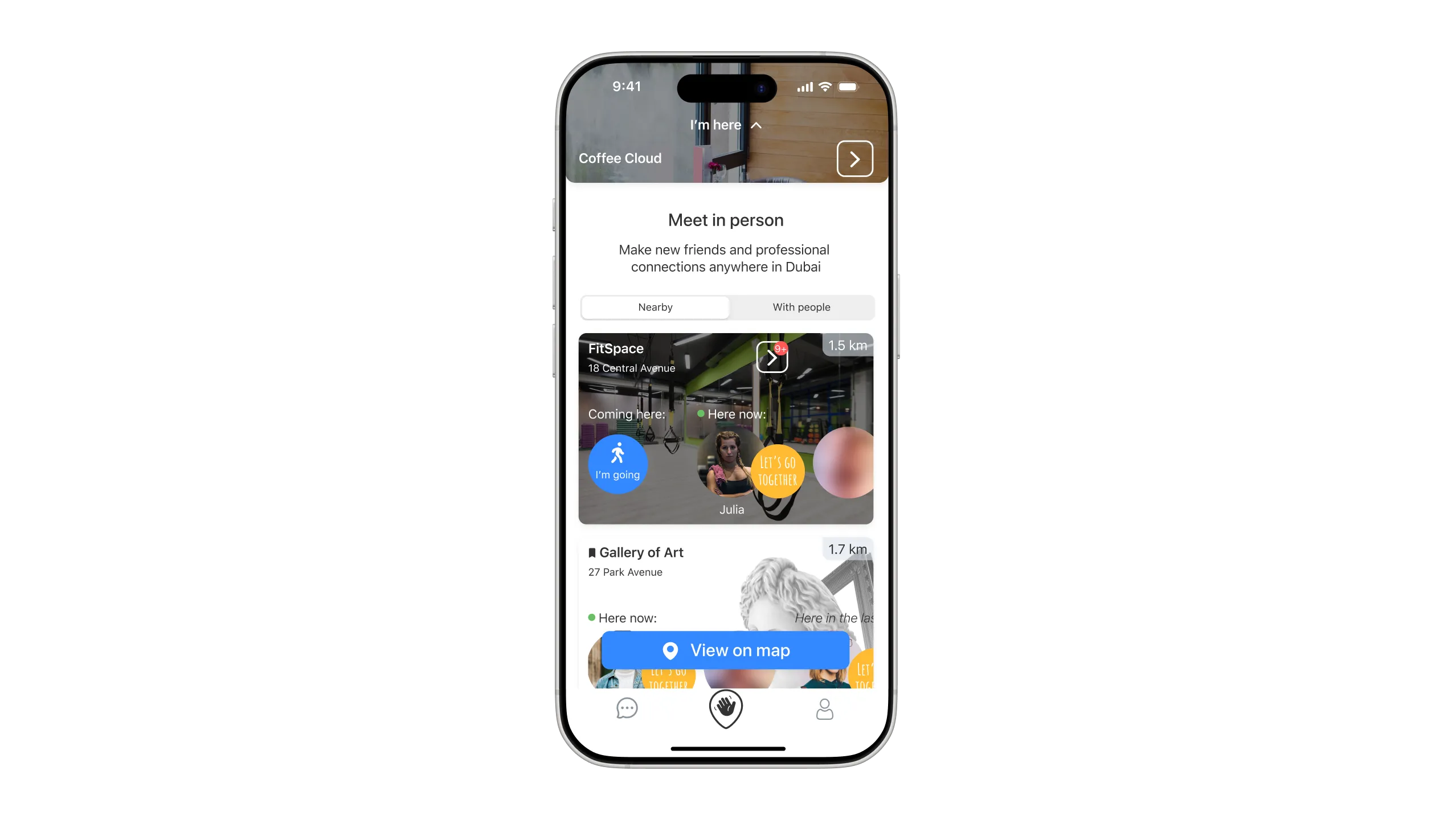
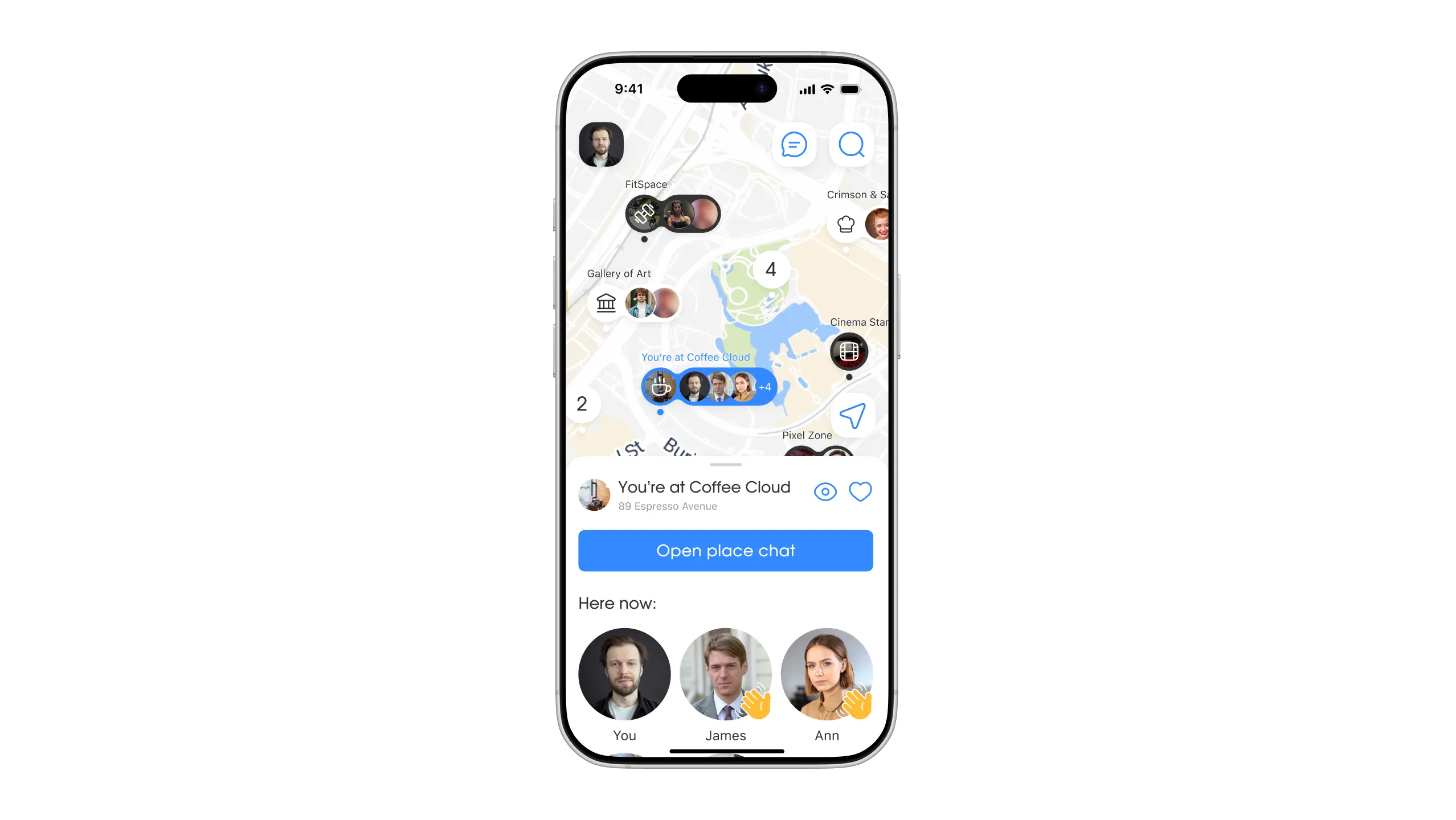 BeforeAfter
Before
Bottom sheet architecture
To preserve spatial context and keep users on the map, the primary interactions with places were moved into a bottom sheet.
Users could quickly browse place details, interact with people, and reveal additional content without losing sight of what was happening around them.
This made navigation through the app feel smoother and more cohesive.
A new model for places
The redesign also reworked how places appeared on the map.
Standard places appeared only when people were present, reducing visual clutter and focusing attention on active locations.
VIP places remained visible at all times and received greater visual prominence in the interface.
This made the map cleaner and easier to scan while clarifying where users were and which places were currently active.
Testing
We tested the hypotheses through an A/B usability study of interactive prototypes with prospective users who had never used the app. The study included 48 participants, split evenly into two groups of 24.
Test setup
Participants received a brief product overview and completed the app's core tasks:
- Interacting with people at a place;
- Navigating between locations;
- Correcting their location when geolocation was inaccurate.
After completing the tasks, participants filled out a questionnaire and shared feedback on the interface version they had used.
We evaluated:
- Task completion time;
- Task success rate;
- Perceived usability;
- Comprehension of the core interaction patterns.
Test results
Version B, built around the map-first model, performed better across every key metric.
Key results:
- Task completion time decreased from 1:29 to 0:59;
- Completion rate increased from 81% to 95%;
- Perceived usability score increased from 6/10 to 8/10.
Testing takeaways
The study confirmed that the map-first model made navigation clearer, reduced cognitive load, and helped users understand the core interaction patterns faster.
Version B drove higher engagement, stronger product comprehension, and more efficient task completion. It became the foundation for the next stage of implementation and product development.
Refining Version B
After reviewing participant feedback, we refined Version B with a focus on the first session and the discoverability of key interactions.
Key changes:
- Added badges to key interactive elements;
- Introduced a welcome message from Bumpin;
- Reinforced social interactions with animation;
- Refined the app store visuals.
These changes made the core mechanics easier to notice and understand within the first few minutes of using the app.
Post-launch results
After launching the map-first experience to real users and refining Version B, the product's core metrics improved.
Key results
The results validated the core research hypotheses: the map-first model made navigation clearer, reduced cognitive load, and helped users understand the product's value and core interaction patterns faster.
The improvement in product metrics exceeded our initial expectations and validated the design strategy.
The map-first model changed more than navigation. It reshaped how users understood the product: the map was no longer a secondary screen, but the foundation of social interaction in Bumpin.